Img Research Demo
Article Explaining Difference Between Aspect-Ratio vs Width/Height Attributes
Difference between aspect-ratio vs width/height.
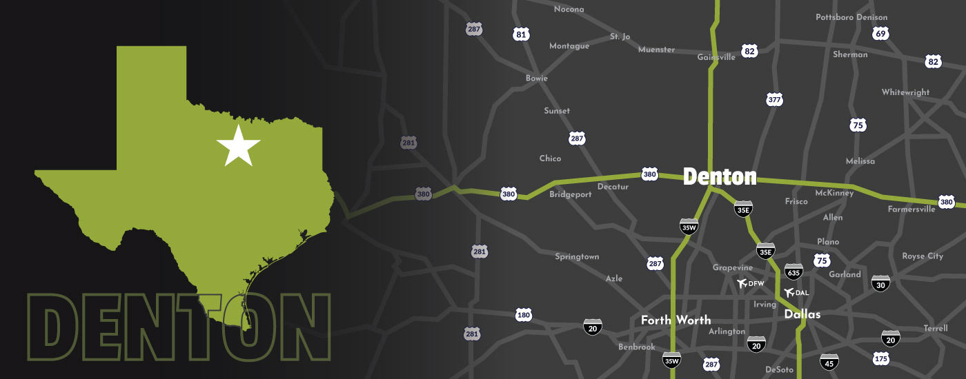
This is utilizing the width and height attributes only without px. On modern browsers (for our use case, anything except IE) this will default the image to use the aspect-ratio CSS property. Since this is using 1400 it's going to have an aspect ratio of 1:1. If you open up your inspector and look for the img tag you'll see this: img[Attributes Style] { height: 1400px; aspect-ratio: auto 1400 / 1400; width: 1400px; }
So by default it's going to look like a giant square. That's good. It's also going beyond the bounds of the container - which it's supposed to because of the width property applied.

Here is another example where the height is set to auto. Once you have that set, like we discussed in our meeting earlier (4/28/23) it'll do the math for you based on these calculation(s). We've also set it to match the container size so the width is 1120 (accounting for the padding) instead of 1400.

Here is an example of the image being set not by height/width but instead by aspect-ratio. Based on reference links, the key difference here is browser support and when to use them. You should use aspect-ratios for designs/img heroes and not for news articles:
Example of a good case for CSS aspect ratio
Example of a good case for set width/height (with height auto?)

Object fit example(s)
fill: this is the default value which stretches the image to fit the content box, regardless of its aspect-ratio.contain: increases or decreases the size of the image to fill the box whilst preserving its aspect-ratio.cover: the image will fill the height and width of its box, once again maintaining its aspect ratio but often cropping the image in the process.none: image will ignore the height and width of the parent and retain its original size.scale-down: the image will compare the difference betweennoneandcontainin order to find the smallest concrete object size.
object-fit: fill

object-fit: contain

object-fit: cover

object-fit: none

object-fit: scale-down

object-fit: fill

Placeholder Layout w/ Aspect Ratios
HD 16:9 - 1280x720 loaded size
Monitor 4:3 - 1280x960 loaded size
Film 3:2 - 1280x853.33 loaded size
Cinemascope 21:9 - 1280x548.57 loaded size
HD 16:10 - 1280x800 loaded size
HD 16:9 - 1280x720 loaded size
Notable reference clips from Josephs original article shared on skype
These are all timestamped and only need to be viewed for about a min each. Feel free to watch the full thing but this is just a quick reference guide.
Modern browsers set the aspect-ratio property based on the width/height attributes.
Static Preview
More than likely can reintroduce a blur up technique here.
Web Vitals Chrome extension (SpeedVitals for FF)
Chrome Extension
Firefox Extension
Speed Vitals site
Critical CSS
SASS critical: this; Presumably have tooling to bundle together a specific CSS sheet that outputs the bare bones CSS needed. Would take some work to achieve.
Reference Links
Original Joseph link
Info about img-aspect-ratio
Media query aspect ratios
